Show posts

This section allows you to view all posts made by this member. Note that you can only see posts made in areas you currently have access to.

Messages - Landith

2
New Projects / Re: Star Wars VII: The Sith Returns
November 13, 2012, 05:18:55 pm
LOL I remember this <3
3
General Discussion / Re: Screenshot Thread
July 09, 2012, 12:12:25 am
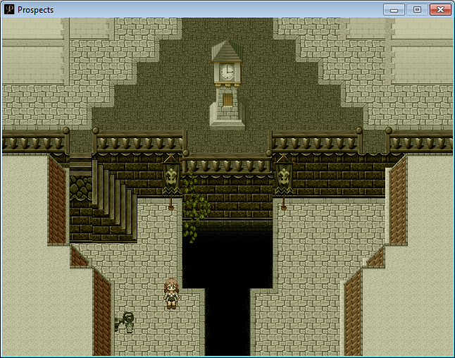
Quote from: Boba Fett Link on July 07, 2012, 12:17:37 pm
The RTP's viewpoint only shows walls facing down. Look at one of the cave tilesets to see my point.

The walls facing down are visible, the left and right aren't, and the up ones are passable because they block the player's view of the ground.

Your walls are visible from both the left and right, and based off the corners the up ones aren't passable.


If you're talking about the red and orange thing, those are roofs. Look at the default Castle Town tileset, those are what are on it.

@mroe- Thanks, I definitely like your up-stairs more and will definitely use them :D
4
General Discussion / Re: Screenshot Thread
July 06, 2012, 07:26:04 pm
Ahhh yea I see what you mean, I'll play with it and see how it looks. I put the small stairs there because I thought it was weird not having them there..it looked odd to me.
5
General Discussion / Re: Screenshot Thread
July 06, 2012, 07:03:20 pm
What do you mean? I know about the error on the stairs where they don't line up but they are in the right perspective as the RTP o_o
6
Looking pretty sweet so far :D
7
Express your Creativity / Re: Hartschall
July 02, 2012, 05:05:44 pm
I listened to it yesterday and enjoyed it (: It sounds like something I would hear professionally done. I just never commented on it :P
8
New Projects / Re: Alive
July 02, 2012, 04:27:50 pm
Like the previous title better, the placement isn't good in the last one.

About your idea, if you could pull it off then yea but be sure to add lots of poses and stuff otherwise it would look bad. I wouldn't do it all at once though... I think flashbacks throughout the first 10 minutes or so of your game would be better than having to sit through 4 flashbacks one after another.
9
General Discussion / Re: Screenshot Thread
July 02, 2012, 05:03:20 am
Going in a different direction for the main city in my game.
Been working on this for about 3 hours, how is it looking?
Castle Town Edited: ShowHide


Obviously there is lots of work to be done, so don't take that near to be a finished map.
10
New Projects / Re: Alive
July 01, 2012, 03:00:39 pm
How about without the shadow's in it? Just flat white. I wanna see if that goes better lol
11
His tail should be slightly skinnier but I like it so far :D
12
Spoiler: ShowHide


I have a challenge for you ;D
If you're up to it make this into a charset where the rat is about the size of an RTP pig. Only skinnier and not pig like :P


P.S. I did not make that concept design, I found it on google I'm just using it as a base for the swamp rat.

Surprisingly there aren't any Giant Rat sprites out for RMXP that I know of.
13
Processor Intel(R) Core(TM) i7-2600 CPU @ 3.40GHz                 7.6              5.9 
Memory (RAM) 8.00 GB                                                         7.6
Graphics NVIDIA GeForce GTX 555                                          7.4
Gaming graphics 4095 MB Total available graphics memory        7.4
Primary hard disk 61GB Free (930GB Total)                              5.9

We have similar scores, being the only major difference being the gaming graphics (but I can still run Crysis on High Settings so you should be pleased with yours), and I promise you won't be disappointed lol

Plus I guarentee you payed less than me lol because I'm an alienware fanboy
14
New Projects / Re: Alive
June 29, 2012, 06:43:47 pm
I for one am not a fan of the Title text for Alive, but I like the overall feel of the title.

I like the crouching sprite but the crawling one just looks odd.. His head shouldn't be straight like that as it's unrealistic... I would make it kinda looking down a bit? Otherwise it's neck would be at a 90 degree angle and that's just odd to me lol. Also it's body... it's really hard to tell what it is. to me it looks like it's legs are backwards? idk what's actually wrong with it but it looks weird to me.
15
Tutorial Requests / Re: LIGHT effect
June 28, 2012, 09:33:43 pm
I still have no idea what you're asking for so I give you both.

Cosmetic Lighting - http://www.hbgames.org/forums/viewtopic.php?t=15030.msg273448

Lighting Script/Demo - http://www.sendspace.com/file/9g6obj

Also Blizzard's Slippy Dark demo has a demo of the torch around the character effect -
Quote from: Blizzard on March 10, 2008, 06:11:06 am
Actually you need a 1280x960, it won't work with a 640x480. ;) Here's the demo.

Download


Give credit to the respectful authors as well.
16
Tutorial Requests / Re: LIGHT effect
June 28, 2012, 02:50:19 pm
What kind of light effects? If you want something that flickers I have a script that I used to use by kellessdee I can dig up. The coding could be better but overall it's not a bad script.

If you want something like static cosmetic lighting then there's a tutorial on RMXP revolution I saw a long time ago I can find for you.
17
RPG Maker Scripts / Re: help with blizz-abs
June 27, 2012, 09:50:10 pm
Blizzabs has a built in caterpillar that allows your party members to attack alongside you. No need for ccoa's caterpillar.

I suggest reading through the manual and looking at the configuration app that comes with Blizz-ABS, as Blizzard already stated above...
18
General Discussion / Re: Mapping Improvement Thread
June 27, 2012, 09:49:14 pm
Mountain: ShowHide

Swamp: ShowHide

Swamp Ingame: ShowHide


I'm not really comfortable with mapping outside maps :/ I feel like they could be improved greatly. Anyone have any ideas? Or is it fine as it is?
19
RMXP Script Database / Re: [XP] Terrain Step Sound
June 27, 2012, 05:38:40 pm
That means you need that file in your audio folder. So whatever 'name of sound' is put it in that folder 'GAME NAME/Audio/Se/Fs/' or whatever it specifies and you won't get that error anymore.
20
General Discussion / Re: Screenshot Thread
June 22, 2012, 01:10:20 pm
I like the grid better that close together. Well done.